







How to Make Custom Acrylic Keychains from Your Artwork: A Complete Guide
Share
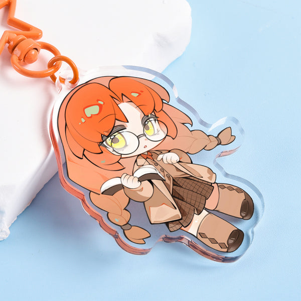
A drawing printed as a photo can only be viewed. Turn it into a keychain, and it can be held, clipped to a backpack, taken to conventions, and carried into everyday life. For illustrators, anime creators, independent brands, and event organizers, acrylic keychains are one of the easiest products to start with when entering the physical merchandise market: they are lightweight, easy to ship, can be custom cut to follow the artwork's outline, and can take on different looks through clear, epoxy, holographic, rainbow, and glitter finishes.
A good-looking keychain is not finished when the image is uploaded. Size, text legibility, cut-friendly contours, hole placement, single- or double-sided printing, white ink, and special surface effects all affect the final product. This guide walks through the complete process, starting with creative positioning and ending with a production-ready item.
First, What Is a Custom Acrylic Keychain?
A custom acrylic keychain is a personalized merchandise item made by printing an illustration, photo, logo, text, or character design onto acrylic, cutting it to the design's outline, and pairing it with hardware such as a split ring, lobster clasp, chain, or phone strap. Unlike standard promotional items with fixed shapes, it can be die-cut around the outer contour of a character, mascot, product, or logo, making it easier to preserve the artwork's identity.
It is especially suited to these uses:
· Illustrators and comic artists: Turn original characters, chibi figures, or illustration series into merchandise you can sell.
· Independent brands and small businesses: Create logo charms, packaging gifts, member rewards, or launch keepsakes.
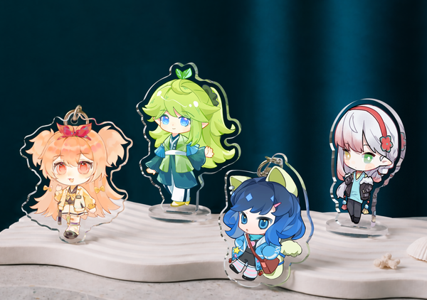
· Anime conventions and Artist Alley vendors: Display multiple characters in a compact format and build a cohesive series with stickers and standees.
· Schools, clubs, and event organizers: Make graduation keepsakes, competition souvenirs, club emblems, or guest gifts.
· Corporate marketing teams: Use them for trade shows, employee gifts, event swag bags, and brand promotion.
Step 1: Decide Who the Keychain Is For
Before you start drawing, answer three questions: Who will buy or receive it? Where will it be displayed? What impression should it convey? These answers directly influence the size, colors, finish, and packaging.
1. Define the use case
If it will be carried on a keyring every day, prioritize light weight, durability, and a simple silhouette. If it will hang from a backpack, you can scale it up and use a more eye-catching holographic or glitter finish. If it is a collectible for a convention, emphasize the character, series numbering, and backing-card design. For a corporate giveaway, make sure the logo, brand colors, and contact information remain clear and readable.
2. Define the core selling point
Do not try to fit every message into a tiny keychain. A product should ideally have one visual focal point, such as a character expression, brand logo, commemorative date, or short line of copy. The clearer the focal point, the easier it is to preserve recognition at a small size.
Step 2: Choose Artwork That Works as a Keychain
Not every full illustration can simply be scaled down. A keychain has limited surface area, and it is often viewed from farther away than a poster, so the original artwork needs to be adapted for merchandise.
Prioritize a clear silhouette
Single characters, pets, logos, food, vehicles, and icon-style artwork are usually well suited to custom cutting. When the background is too complex, keep the subject and simplify the background into color blocks, halos, stars, or a clean border. This reduces fragile protrusions and gives the product a cleaner outline.
Control details and text
Eyelashes, strands of hair, and decorative lines that look crisp on screen may blur when reduced. Check the design at its target size instead of only zooming in. Keep text short, avoid overly thin type, and use high-contrast colors. Put truly important information inside the safe area, away from the cut edge and hanging hole.
Let color support recognition
Highly saturated colors are not always best. What matters is sufficient contrast between the subject and background, and between the text and its base color. If you plan to use clear acrylic, decide in advance which areas should remain transparent and which should receive white ink; otherwise, colors may look lighter on the transparent substrate than they do on screen.
Step 3: Prepare Production-Ready Artwork Files
File preparation is where rework happens most often. Different products and finishes may have different templates and requirements, so the supplier's template, upload page, and digital proof should be treated as the final authority. The principles below will help you submit more reliable files.
1. Use a sufficiently sharp source file
Prepare raster artwork at a high resolution based on the final product size. Standard print workflows commonly recommend 300 DPI. Keep vector logos and text in vector format whenever possible, rather than reusing screenshots, compressed files, or downloads from social media.
2. Keep the background transparent
If you want the product cut around the subject, submit a transparent PNG, PSD, or a vector file that meets the supplier's requirements. A white background is not the same as transparency: white may be interpreted as an area to print in white, while transparency means no ink or visible clear material.
3. Set the cut line and safe area
The cut line determines the product's outer shape. Keep the subject, text, and important details a safe distance from it. Sharpened, very thin, or overly complex contours should be rounded where appropriate to reduce breakage risk and improve the feel in hand.
4. Plan the white-ink areas
Color artwork on clear acrylic usually needs a white-ink backing to look full and saturated. If you want a translucent or light-through effect, intentionally reduce or remove white ink in those areas. Before submitting, mark the print areas, transparent areas, and white-ink areas in different colors, then repeat the instructions in the notes.
5. Handle color modes carefully
Screens emit light, while printed pieces reflect it, so the colors cannot match perfectly. During design, use a print-appropriate color mode and avoid relying on extremely bright fluorescent colors. More importantly, review the supplier's digital proof to confirm that color, orientation, white ink, and transparent areas match your expectations.
Step 4: Choose the Right Size
Bigger is not always better. Size must balance design detail, portability, cost, and use case. The ranges below are useful for early planning; the actual available sizes should always follow the current product page.
|
Common planning size |
Best for |
Usage notes |
|
Approx. 1-1.25 in |
Simple logos, icons, small portraits |
Lightweight, but not suitable for tiny text or complex linework |
|
Approx. 1.5-2 in |
Half-body characters, mascots, brand graphics |
Balances recognition and portability; suitable for most merchandise |
|
Approx. 2.5-3 in |
Full-body characters, complex compositions, display charms |
Stronger visual impact; pay attention to weight, cost, and packaging |
A practical test: print the design on ordinary paper at the target size, cut it out, and hold it in your hand or hang it from your bag. This simple test often reveals tiny text, an awkward silhouette, or an impractical hole position more easily than repeatedly zooming in and out on a screen.
Step 5: Choose Single- or Double-Sided Printing
Single-sided design
Best for logos, front-facing characters, event giveaways, and budget-sensitive projects. The design focus is concentrated and approval is simpler. When ordering, still confirm how the back will appear and whether the artwork will show through or appear mirrored from the other side.
Double-sided, same artwork
The same visual is kept on both sides, which works well for keychains that are frequently flipped. Pay special attention to text direction: if the front artwork is simply mirrored onto the back, the text may appear backward.
Double-sided, different artwork
Use a character's front on one side and back on the other, or pair an illustration with a logo and brand information. This adds collectible appeal, but it also means checking the orientation, placement, and white-ink areas of both designs separately.
Step 6: Choose a Finish That Supports the Artwork
The same artwork can feel completely different with different finishes. Do not choose only by asking which one sparkles most; choose the finish that supports the artwork itself.
|
Finish |
Visual characteristics |
Best for |
Selection tip |
|
Clear acrylic |
Crisp, light, and versatile |
Logos, characters, minimalist illustrations |
The best foundation style for a series |
|
Epoxy |
Rounded, glossy surface with a tactile feel |
Highly saturated characters, gift editions |
Adds a refined feel; watch the overall thickness |
|
Holographic |
Star, heart, or shattered-glass effects that shift with the viewing angle |
Fantasy, idol, gaming, and trend-focused themes |
Avoid letting reflective patterns cover important facial features or text |
|
Rainbow |
Iridescent reflection with visible color shifts |
Dreamy, cute, and summer themes |
Works best with artwork whose base colors are relatively simple |
|
Glitter |
Fine sparkles with a stronger stage presence |
Holiday, magic, idol, and limited editions |
Use to reinforce selected areas; do not stack too many visual elements |
Step 7: Choose Hardware, Accessories, and Packaging
Hardware is not a minor detail. It affects how the product is used, its overall style, and the customer's first impression of quality. On its customization page, Feystar shows several options, including split rings, chains, lobster clasps, star-shaped lobster clasps, ball chains, and phone straps.
How to choose common accessories
· Split ring: A classic construction for keys, event giveaways, and corporate gifts.
· Lobster clasp: Easy to open and close; good for backpacks, zippers, and Artist Alley merchandise.
· Star-shaped or colored clasp: Highly decorative; a good fit for anime, cute, and character themes.
· Ball chain: Lightweight and simple; suitable for tags, packaging hangtags, and small charms.
· Phone strap: Suitable for phones, cameras, handheld consoles, or other devices with a strap hole.
Step 8: Review the Digital Proof and Sample Carefully
Proof approval is not a formality. It is the last low-cost opportunity to catch errors before production. Do not only ask whether the overall image looks right; check each item one by one.
· Outer contour: Is the cut line smooth, and are sharp corners or thin connectors safe?
· Size: Does the label refer to the overall size or the artwork size, and are the units correct?
· Hole placement: Does it cover the character's head, text, or logo? Will the center of gravity hang naturally?
· Front and back: Are the orientation, mirror relationship, and corresponding positions of different designs correct?
· Transparency and white ink: Which areas are transparent, and which need a white-ink backing?
· Color and detail: Is the text readable? Could thin lines disappear? Are skin tones and brand colors reasonable?
· Hardware and quantities: Do clasp styles, colors, packaging, and quantities for each design match?
For a first collaboration, an important new product, or a large order, consider buying a sample pack or producing a small batch first. Check the actual transparency, thickness, edges, printing, protective film, and hardware feel.
Step 9: Plan Quantity, Production, and Delivery
The larger the quantity, the lower the unit cost is usually, but the higher the inventory risk. When launching a new character for the first time, test with a smaller quantity. Once you have pre-order data, convention sales records, or steady corporate demand, scale up the order. Do not look at unit price alone; also calculate packaging, platform fees, shipping, loss, and promotional discounts.
For timing, work backward from the date you need to receive the order rather than forward from the order date. Feystar's current standard production time is typically 4-5 business days, with shipping usually taking 7-10 business days. Finish complexity, order volume, proof-approval speed, destination, and peak season can all affect the schedule. Use the latest information shown at checkout as the final reference, and build in buffer before a convention or launch event.
At minimum, allow time for
· Sample production and delivery (if needed)
· Full production
· International shipping, customs clearance, and local delivery
· Quality inspection, packaging, and pre-event stocking
The 8 Most Common Mistakes
1. Using a small image downloaded from social media, resulting in a blurry product.
2. Mistaking a white background for a transparent background.
3. Making text too small or the type too thin to read after scaling down.
4. Using an overly complex cut contour with fragile points and thin connectors.
5. Placing the hole based only on the artwork, without considering the center of gravity when hanging.
6. Skipping the mirror and text-direction check on double-sided designs.
7. Choosing a special finish only for maximum sparkle and obscuring the artwork's focal point.
8. Leaving no buffer for samples, revisions, shipping, or the event date.
Pre-Order Submission Checklist
|
No. |
Check |
|
1 |
The source file is sharp and the raster resolution meets the current production requirements |
|
2 |
The background, print areas, and white-ink areas are correct |
|
3 |
The cut line, bleed, and safe margins follow the template |
|
4 |
Text remains clear and readable at the final size |
|
5 |
Size, quantity, and per-design allocation are correct |
|
6 |
The correct choice was made between single-sided, double-sided same-artwork, and double-sided different-artwork printing |
|
7 |
Hole placement, hanging direction, and center of gravity are reasonable |
|
8 |
The finish, hardware color, and packaging options are correct |
|
9 |
The proof's contour, colors, transparent areas, and orientation have been checked item by item |
|
10 |
There is enough buffer between production, shipping, and the event date |
Frequently Asked Questions
Can I customize acrylic keychains without professional design software?
Yes. A clear PNG, photo, or logo is usually enough to start the conversation, but layered or vector files are better for complex transparency, different artwork on each side, and special cutting. After upload, follow the production team's file check and digital proof.
Which should I choose: PNG, PSD, AI, or PDF?
A high-resolution transparent PNG works for a simple die-cut illustration. PSD, AI, or an editable PDF is more convenient when you need layers, white ink, cut lines, or double-sided positioning. Always follow the format requirements on the current product page.
Why does clear acrylic still need white ink?
Color ink printed directly on clear material can look lighter. White ink acts as a base layer behind the colors and helps the artwork look fuller. If you want to preserve a light-through effect, reduce the white ink in the specified areas.
What is the difference between epoxy and standard clear acrylic?
Standard clear acrylic looks crisp, light, and versatile. Epoxy creates a rounder, glossy surface with a more tactile feel, making it suitable when you want a more refined finish. Actual durability and structural performance depend on the production method.
Should I order a sample the first time?
For an important new product, complex finishes, or a large project, it is worth reviewing a sample pack or small batch first. You can check the color, transparency, edges, protective film, hardware, and packaging before committing to the final quantity.
How can I reduce inventory risk when producing merchandise for the first time?
Start with one to three of your most recognizable designs and test them in a smaller quantity. Use pre-orders, social media polls, or in-person event records to gauge demand before gradually adding more designs and increasing quantities.
Bring Your Artwork from the Screen into Real Life
A good acrylic keychain is more than a miniature illustration. It is a product shaped by design, material, printing, structure, and the way it will be used. By defining the audience first, optimizing the artwork for its final size, handling transparency, white ink, cut lines, and hole placement, choosing a finish that truly suits the design, and reviewing the digital proof item by item, you can greatly reduce rework and create merchandise that fans want to collect and brands can use for the long term.
Ready to turn your artwork into a physical product? Visit the Feystar Custom Acrylic Keychains page, choose the size, quantity, and finish, upload your design, and review the digital proof before production.